

Online Math Tutoring for Primary & Middle Schoolers: Options & Pricing 2026
Math Education8 min
Math Education

Dewi Lestari
Mathematics Specialist
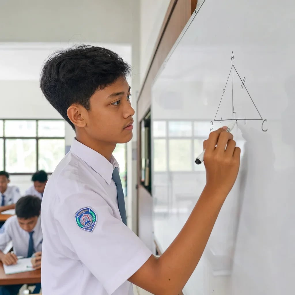
Statistics is the branch of mathematics concerned with collecting, presenting, processing and interpreting data. At school it arrives in stages: simple data presentation in primary years, measures of central tendency in Year 6 and Year 8, then grouped data and standard deviation in senior secondary. This page summarises the whole topic and links to each formula in detail.
| Term | Meaning | Example |
|---|---|---|
| Data | A collection of observed values | Test scores for one class |
| Population | Every object under study | All secondary students in a school |
| Sample | A subset taken from the population | 30 randomly chosen students |
| Datum | A single data value | One student's score of 85 |
| Frequency | How often a value occurs | The score 8 appears 5 times |
Telling a population from a sample is the question that appears most often in tests and is answered wrongly most often.
These three answer the question "which single value represents the whole data set".
Mean — the sum of all values divided by how many there are.
Median — the middle value once the data is sorted. With an even count, it is the average of the two middle values.
Mode — the value that occurs most often.
Take the data 6, 7, 7, 8, 9, 9, 9, 10.
Each formula is covered in full in how to calculate the mean, the median formula and the mode formula.
This is rarely taught and the most useful part. When one extreme value exists, the mean is dragged towards it and misleads. Salaries of 3, 3, 4, 4, 50 (million) have a mean of 12.8 — yet four of the five people earn under 5. Here the median is more honest. For non-numeric data such as favourite colour or best-selling shoe size, the mode is the only measure that works at all.
These answer "how widely scattered is the data".
| Format | Best suited to |
|---|---|
| Frequency table | Large raw data sets with repeats |
| Bar chart | Comparing categories |
| Line graph | Change over time |
| Pie chart | Showing proportions of a whole |
For a pie chart, each slice is angle = (frequency ÷ total) × 360°, or percentage = (frequency ÷ total) × 100%. See also how to calculate percentages.
1. Finding the median without sorting first. This is the single biggest source of error across the whole topic, and it is entirely avoidable.
2. Confusing mean, median and mode. A memory hook that sticks: mode = most frequent; median = middle.
3. Dividing by the wrong number when frequencies are involved. For "5 students scored 8", the divisor is the number of students, not the number of table rows.
4. Reading a chart without checking its scale. A bar chart whose axis does not start at zero makes a small gap look dramatic. A child trained to check the scale will not misread a graph, at school or in the news.
5. Assuming a pie chart need not total 100%. If the percentages do not add to 100, something has been miscalculated.
Yes, Algonova Indonesia offers a complete math program for kids aged 6 to 17, covering all school levels from primary, junior high, to senior high. Each level has a dedicated curriculum aligned with the child's cognitive stage and the Indonesian school curriculum (Kurikulum Merdeka). For primary school (6-12): basic operations, fractions, simple geometry, and introduction to algebra. For junior and senior high (13-17): algebra, quadratic equations, basic trigonometry, advanced geometry, basic calculus, statistics, UTBK SNBT preparation, and advanced topics. All classes are online live with certified teachers in small groups of up to 10 students per class. Our method is built on visual conceptual understanding, not formula memorisation. Try a free trial class for a child's level diagnostic and recommended learning path.
Yes. For mathematics Algonova Indonesia offers a free 45 minute diagnostic session with no commitment. The format is called Metode Diagnostik Algonova. No credit card is needed and there is no auto subscription afterwards. Note that these 45 minutes are a diagnostic session, not a regular class. A regular math class runs 90 minutes, while the coding and design tracks have their own introductory format, a free 60 minute master class. During the diagnostic a certified teacher maps the child's level: which topics are already solid and where the gaps sit. The child also tries the online learning platform and works through first problems matched to their school level. After the session parents receive a personal learning plan based on the diagnostic result, plus a transparent explanation of program, schedule, and pricing from Rp 102,000 per lesson. To book, fill in the form on the website.
Algonova Indonesia math classes come in three formats: 1-on-1 private, a mini-group of 2–4 kids, and a group of up to 10 students with similar ability and school grade levels. This small group format is deliberately chosen because it provides the optimal balance between social interaction with peers and personal teacher attention. In a mini-group, every child averages about 10 minutes of direct teacher interaction in a single session. Compare with traditional offline bimbel typically of 20-40 students per class — direct interaction there is only 1-2 minutes per child, or none at all. For families wanting full attention, one-on-one private class format is also available with one student per teacher. This format is more intensive and suits competition preparation, catching up from severe gaps, or specific topic depth.
Kids math tutoring at Algonova Indonesia starts from Rp 102,000 per lesson. The price includes a live session with a certified teacher, digital learning materials, online platform access, and an official certificate upon completing each program level. The transparent 'starting from' rate is the same across all school levels — the final quote depends only on class format (private, mini-group, or group) and how many sessions per week you choose. Groups are the most affordable option; private classes are more intensive and suit competition prep or closing larger gaps. Full pricing details are shared transparently after the free trial class. No surprise fees — every cost component is explained before formal enrolment. To receive the latest pricing details, fill in the booking form on the website.
Yes, all Algonova Indonesia math programs are fully available online with live sessions taught by certified teachers — not recorded videos. Kids learn in real time in small groups of up to 10 students, with two-way interaction, live Q&A, and problems worked on alongside the teacher throughout the class. To join online class, a child only needs a computer or laptop with a camera, a stable internet connection, and a headset. The Algonova platform runs directly in the browser so no special software installation is required. Kids can write problems in a regular notebook or on a tablet with stylus. Because every class is fully online, families can join from anywhere in Indonesia and easily fit lessons around school and other activities.
Three main factors make Algonova math tutoring effective for Indonesian kids. First, the curriculum aligns with Kurikulum Merdeka used in national schools, so what is learned at Algonova directly helps with school lessons and exams. Second, the methodology is built on visual conceptual understanding (not formula memorisation). Kids learn to break big problems into small systematic steps — a thinking pattern transferable to other subjects like science and IT. Third, small groups of up to 10 students per class let teachers adjust pace to each child's ability. Slower kids get personal help, while faster kids don't get bored waiting. The result: most Algonova students see math grade improvements at school within the first 2-3 months.
Algonova Indonesia is specifically designed to help kids behind catch up in a way that doesn't make them feel defeated or ashamed. Every new student starts with a free diagnostic during the trial class to identify exactly where the gap occurred. Based on the diagnostic, the teacher builds a personal learning path that closes the gap from the most basic foundation. For example, a junior high student weak in algebra might actually be behind in primary school fraction operations. We go back to the foundation, then progress gradually without comparison with other peers. Many Algonova students who initially started 1-2 grade levels behind successfully caught up and even surpassed classmates within 3-6 months with weekly classes and consistent homework. It's never too late to start. Try a free trial class for diagnosis without commitment.
Statistics is the branch of mathematics concerned with collecting, presenting, processing and interpreting data.
It is taught in stages: data presentation in Years 4 to 5, mean median and mode in Year 6, more depth in Year 8, and grouped data with standard deviation in Year 12.
The mean is the average, the sum divided by the count. The median is the middle value once the data is sorted. The mode is the value that occurs most often.
Use the median when an extreme value drags the average, and the mode when the data is not numeric, such as colours or brands. The mean suits numeric data with a reasonable spread.
A population is every object under study, while a sample is the subset actually measured.
The most common one is finding the median without sorting the data first.
Statistics is not a single chapter but a strand that returns from primary through senior secondary, each time harder:
| Stage | What is covered |
|---|---|
| Years 4–5 (SD) | Collecting data, simple tables, bar charts |
| Year 6 (SD) | Mean, median and mode for ungrouped data |
| Year 8 (SMP) | Central tendency in more depth, pie charts, interpreting data |
| Year 12 (SMA) | Grouped data, quartiles, standard deviation |
Because the strand repeats, a small gap in Year 6 only shows its effect in Year 8. If a child struggles at secondary level, first check whether they can sort a data set and find a mean without a calculator. Per-year summaries are in the Year 6 maths overview and the Year 8 overview.
Want your child to learn maths with an experienced mentor? Try a free Master Class at Algonova — a 60-minute session to assess their level, at no cost.

Algonova worldwide
Contact
Whatsapp: +62 21 50996971
Email: info@algonova.id
Address
Coworking Area, Gedung IT 6 Lantai Dasar, Nongsa Digital Park, Jalan Hang Lekiu, Kelurahan Sambau, Kecamatan Nongsa, Batam, Indonesia Directorate General of Consumer Protection and Trade Compliance – Ministry of Trade of the Republic of Indonesia. WhatsApp Ditjen PKTN: 0853-1111-1010.
PT Algonova Indonesia Cerdas All rights reserved 2026
